Next Door Cafe

Next Door Cafe

OVERVIEW

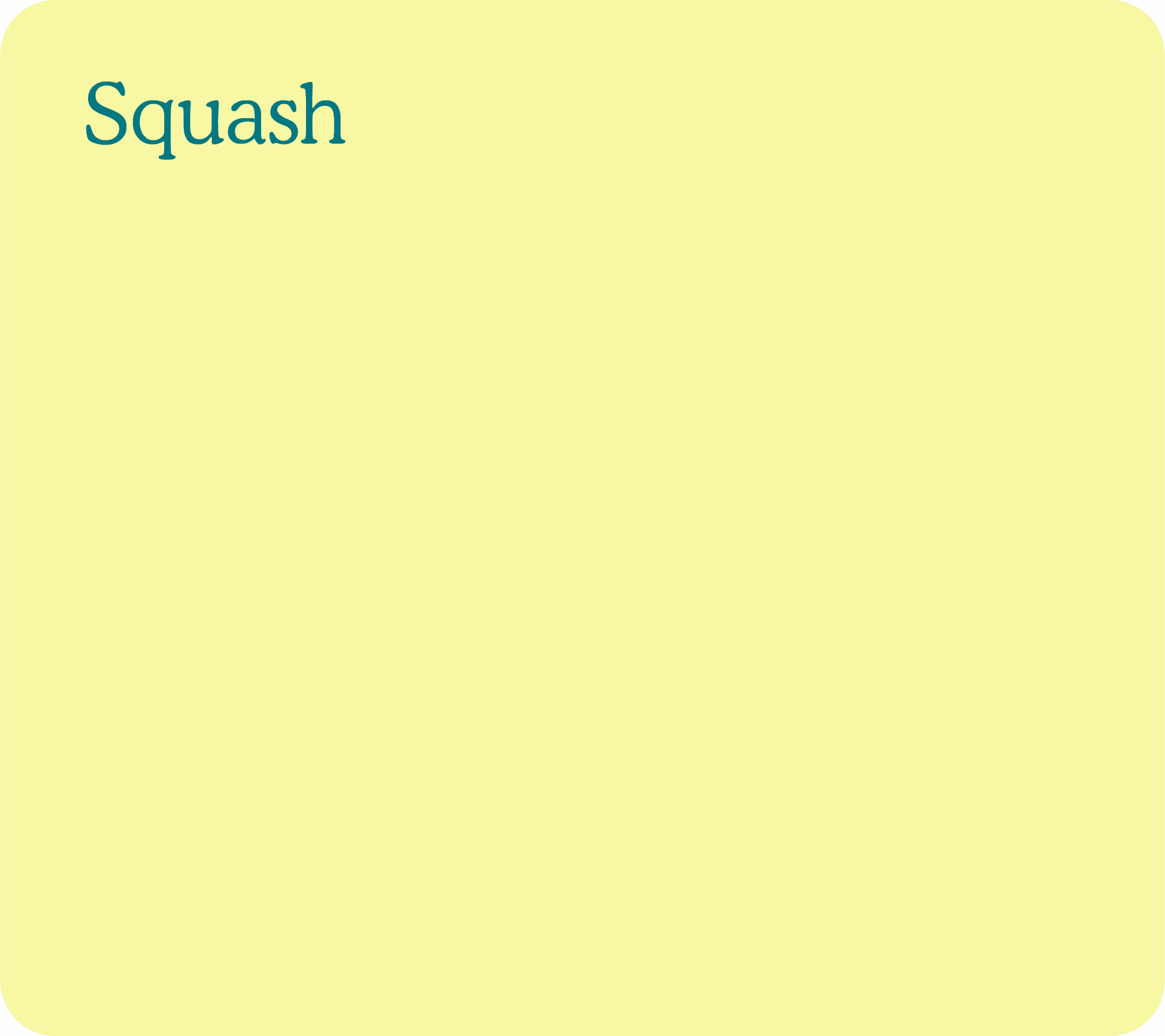
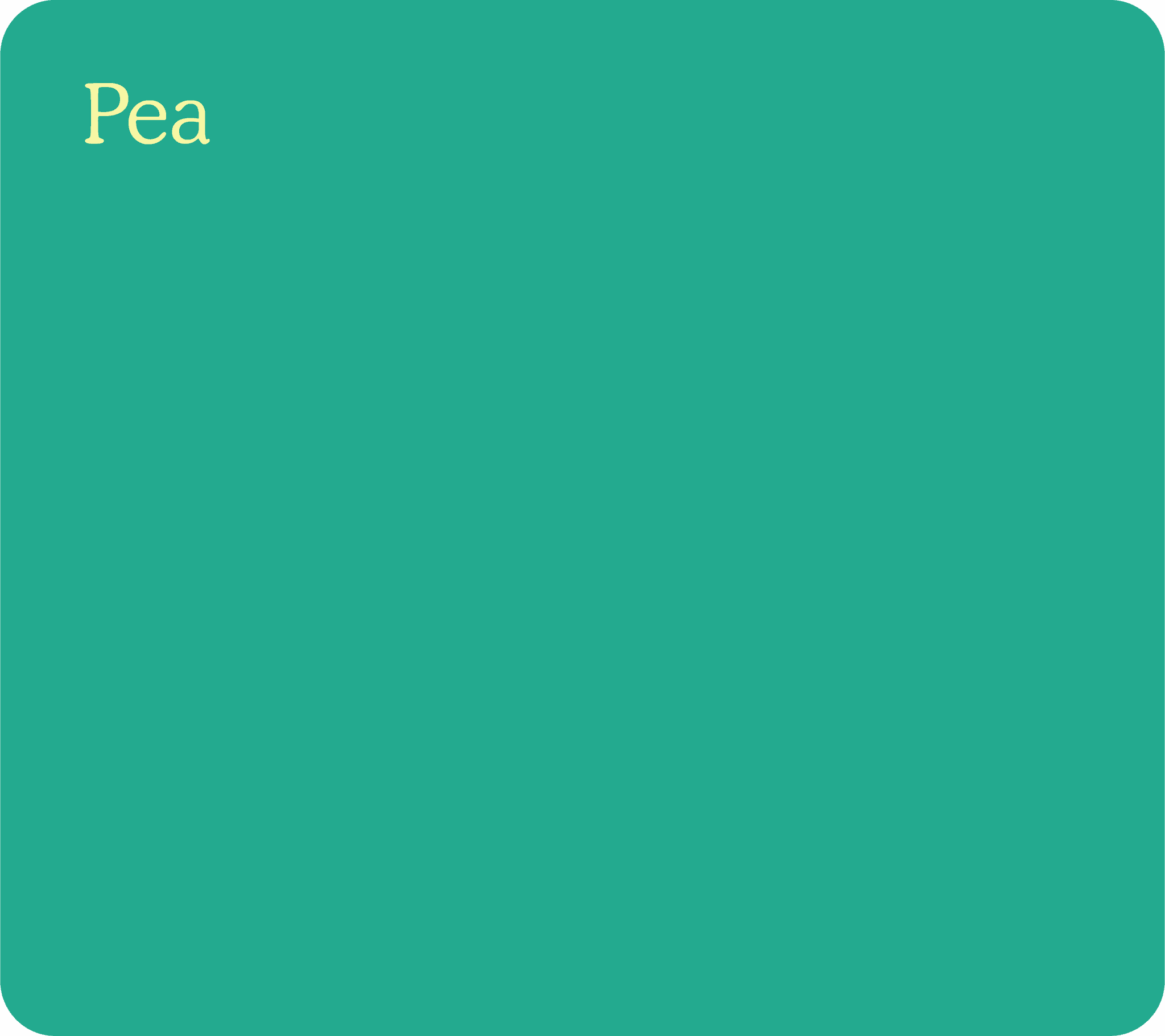
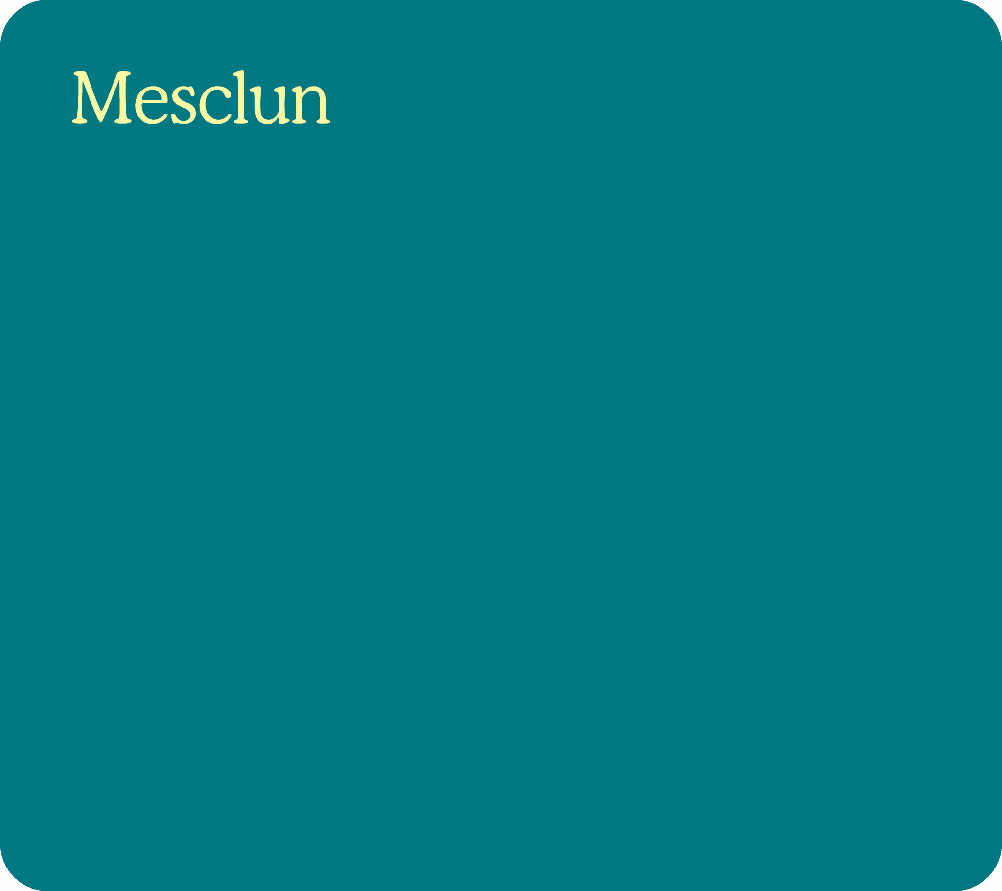
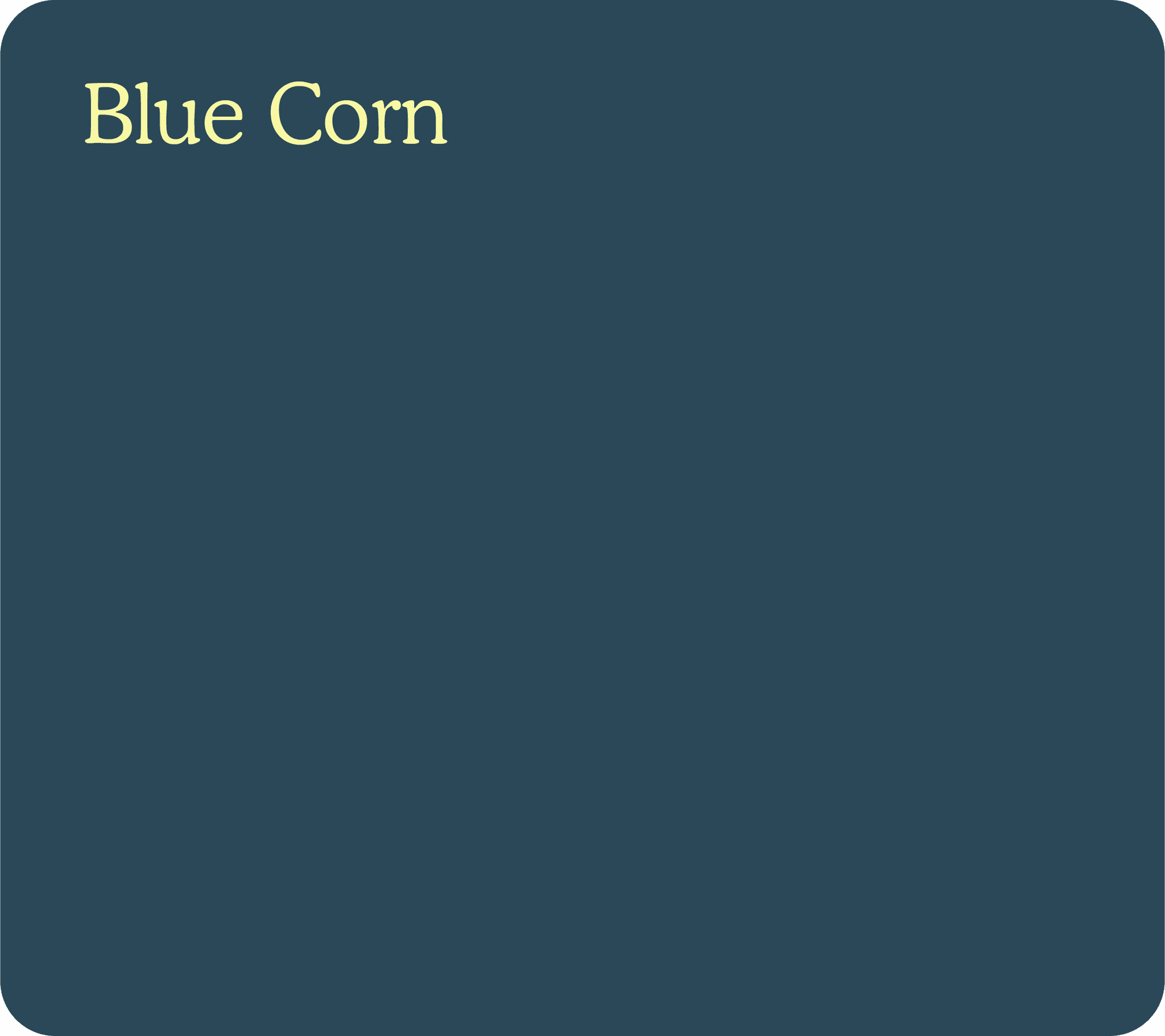
Next Door Café is a neighborhood café concept built around good food, familiar faces, and the simple pleasure of having something good right next door. Developed as an extension of the Community Culinary School of Charlotte, the identity brings a warm, approachable personality to the organization’s café through bold typography, a rich monochromatic palette, and playful details inspired by the familiarity of being among neighbors.

YEAR

2026

AGENCY

Thinkso

ROLE

Brand Designer

SCOPE

Brand Identity

Art Direction
Print & Collateral
Packaging
NEXT DOOR CAFE

Next Door Café extends the Close-Knit spirit beyond the classroom and into the community. The café gives students an opportunity to put their skills into practice while generating significant revenue that helps support the school and its programs. Designed to feel like the neighborhood spot that always feels familiar, its identity brings a warmer, more playful personality to the larger CCSC brand while still feeling unmistakably part of the same family.
Logo
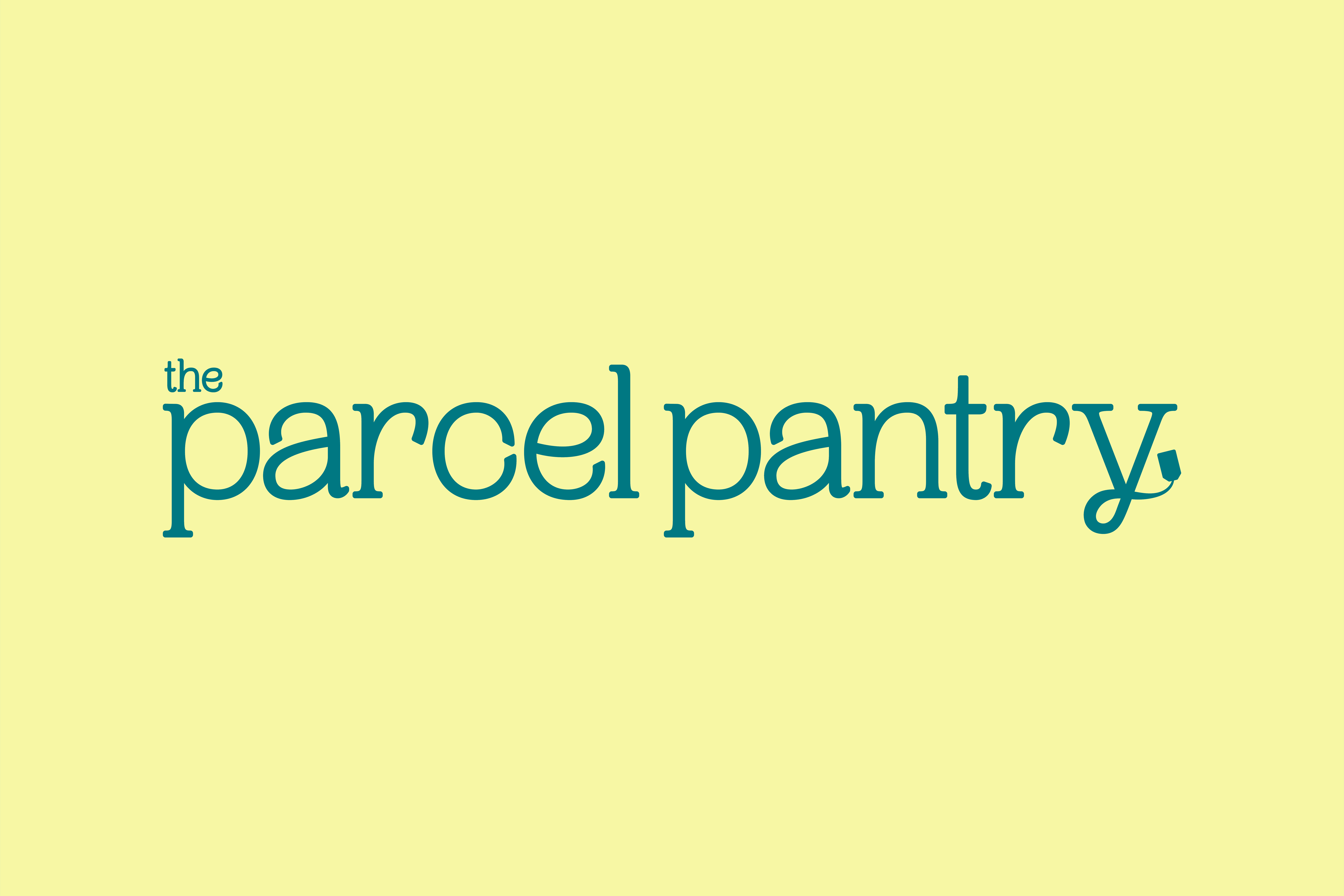
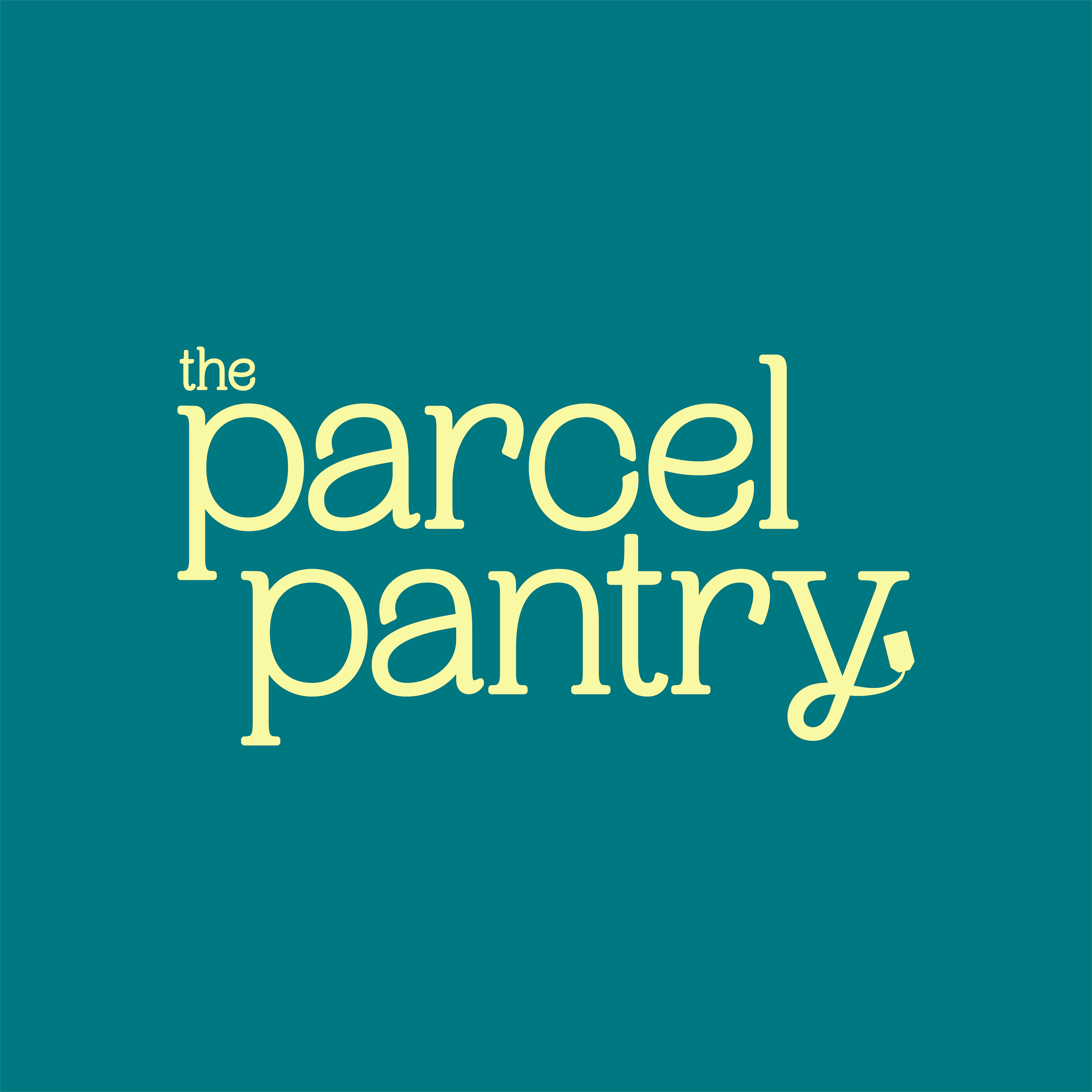
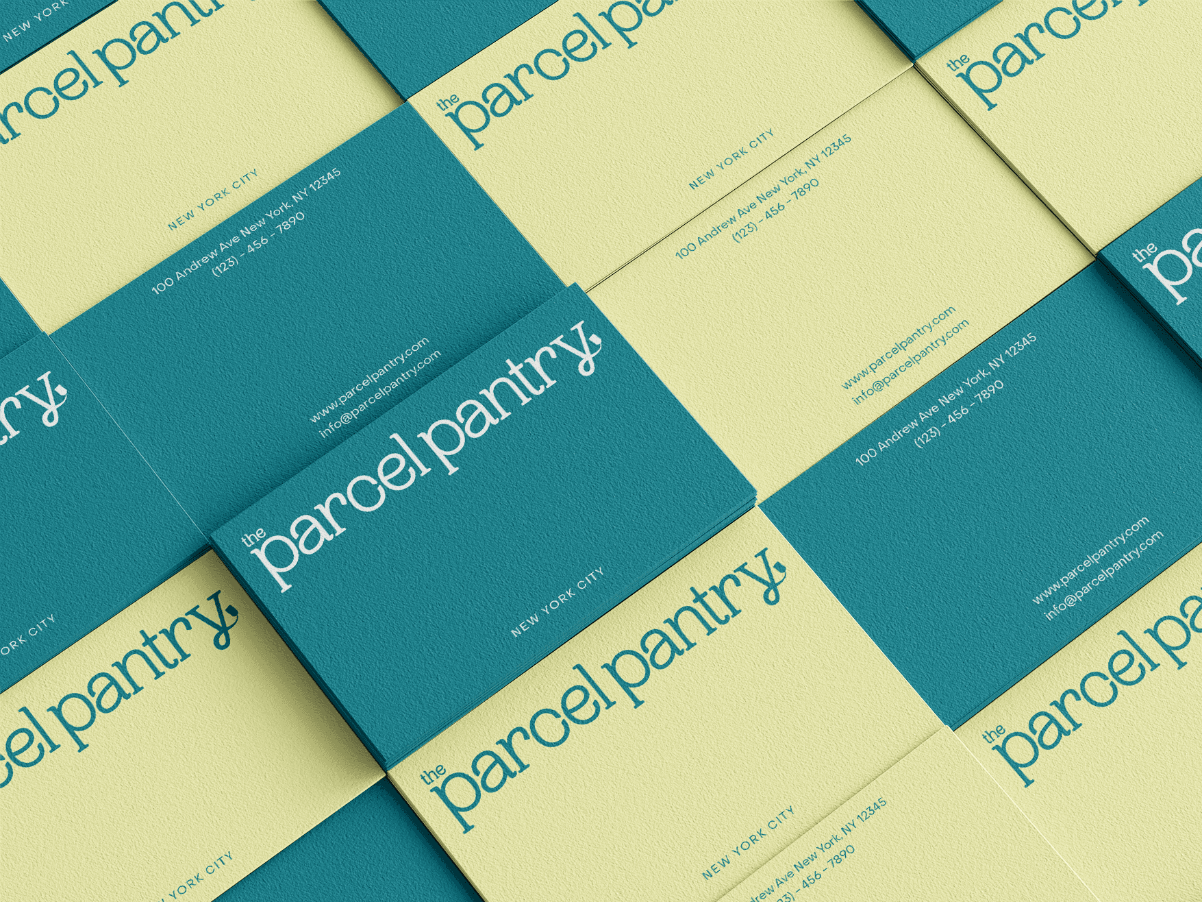
The Parcel Pantry’s logotype is a custom logotype built on the bones of the font PP Woodland [Ultralight]. The logotype is set in lowercase and has been altered to contain heavier letterforms as well as rounded corners. These alterations work to increase legibility and implement a sense of warmth and friendliness. The tail of the “y” letterform has been altered to feature a vintage parcel tag, a direct reference to the program's name.


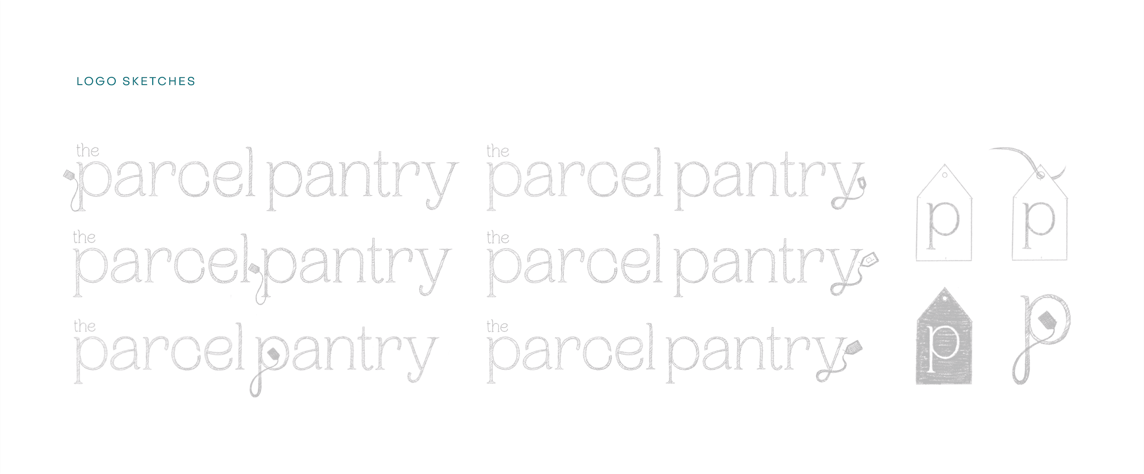
The submark is a visual shorthand of the logotype— a direct callback to the parcel tag seen at the tail of the “y” letterform. The addition of the “p” letterform within the parcel tag shape works to strengthen brand association and has the additional benefit of functioning as a sort-of lettermark. The submark serves to give the visual identity distinction in small instances, such as an app icon or social media profile picture.

The Parcel Pantry’s logotype is a custom logotype built on the bones of the font PP Woodland [Ultralight]. The logotype is set in lowercase and has been altered to contain heavier letterforms as well as rounded corners. These alterations work to increase legibility and implement a sense of warmth and friendliness. The tail of the “y” letterform has been altered to feature a vintage parcel tag, a direct reference to the program's name.

The submark is a visual shorthand of the logotype— a direct callback to the parcel tag seen at the tail of the “y” letterform. The addition of the “p” letterform within the parcel tag shape works to strengthen brand association and has the additional benefit of functioning as a sort-of lettermark. The submark serves to give the visual identity distinction in small instances, such as an app icon or social media profile picture.

Visual Language
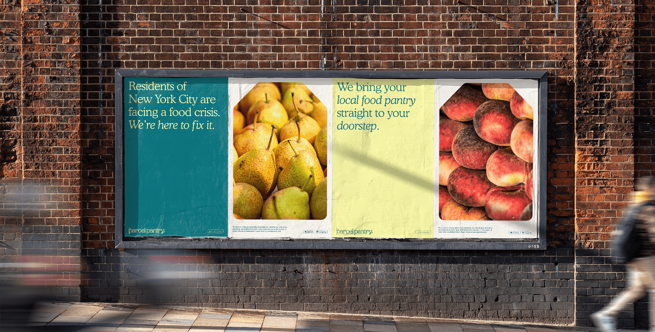
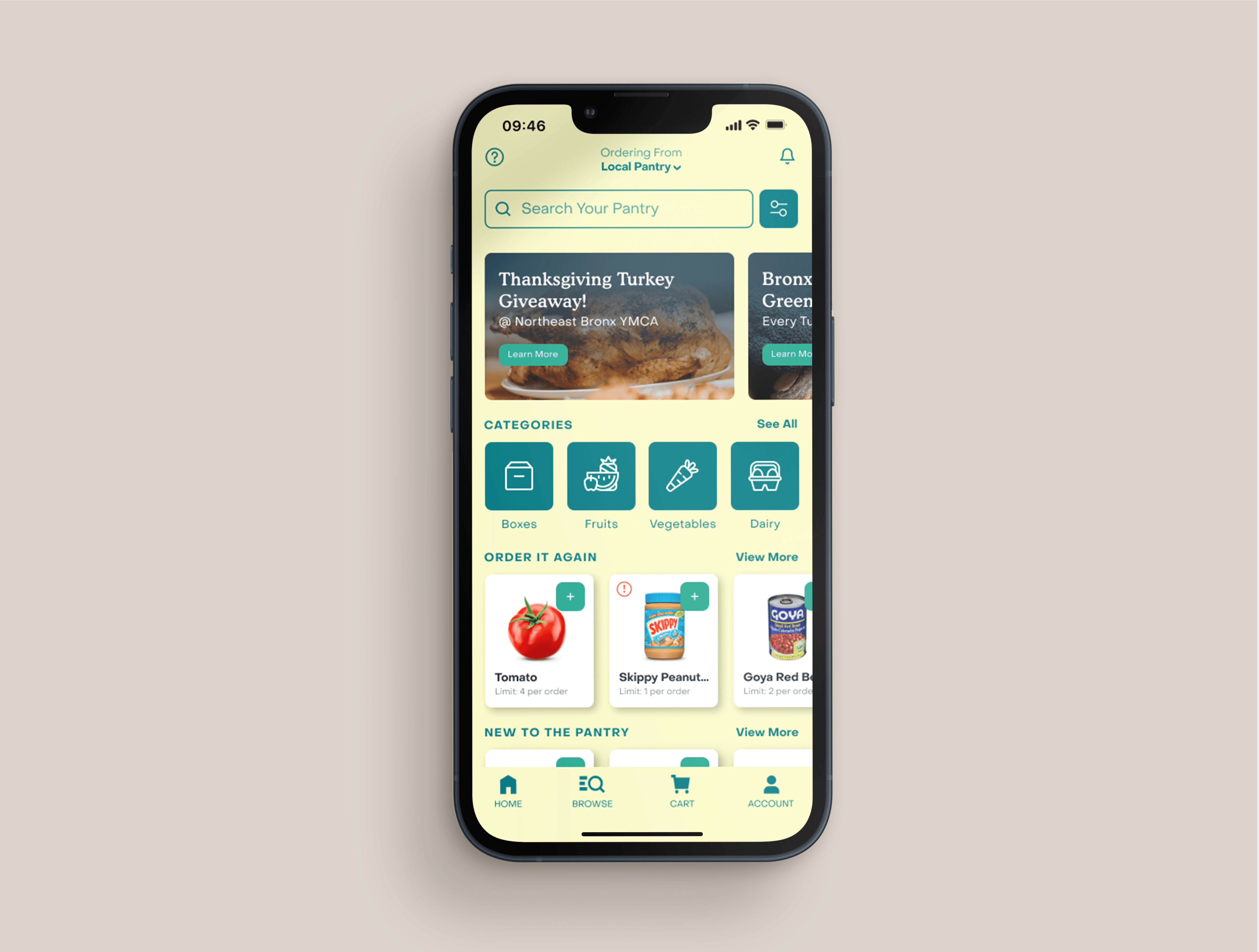
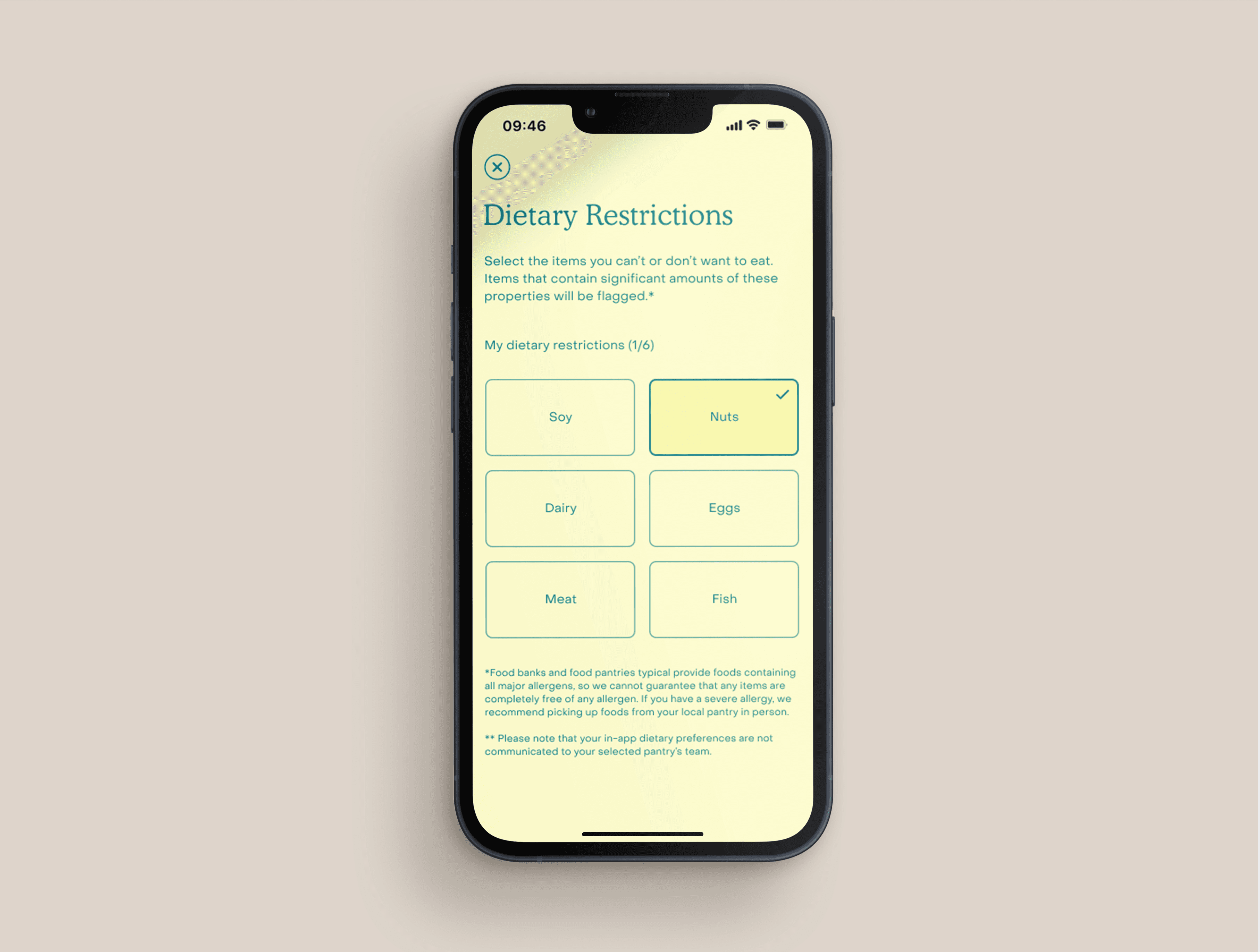
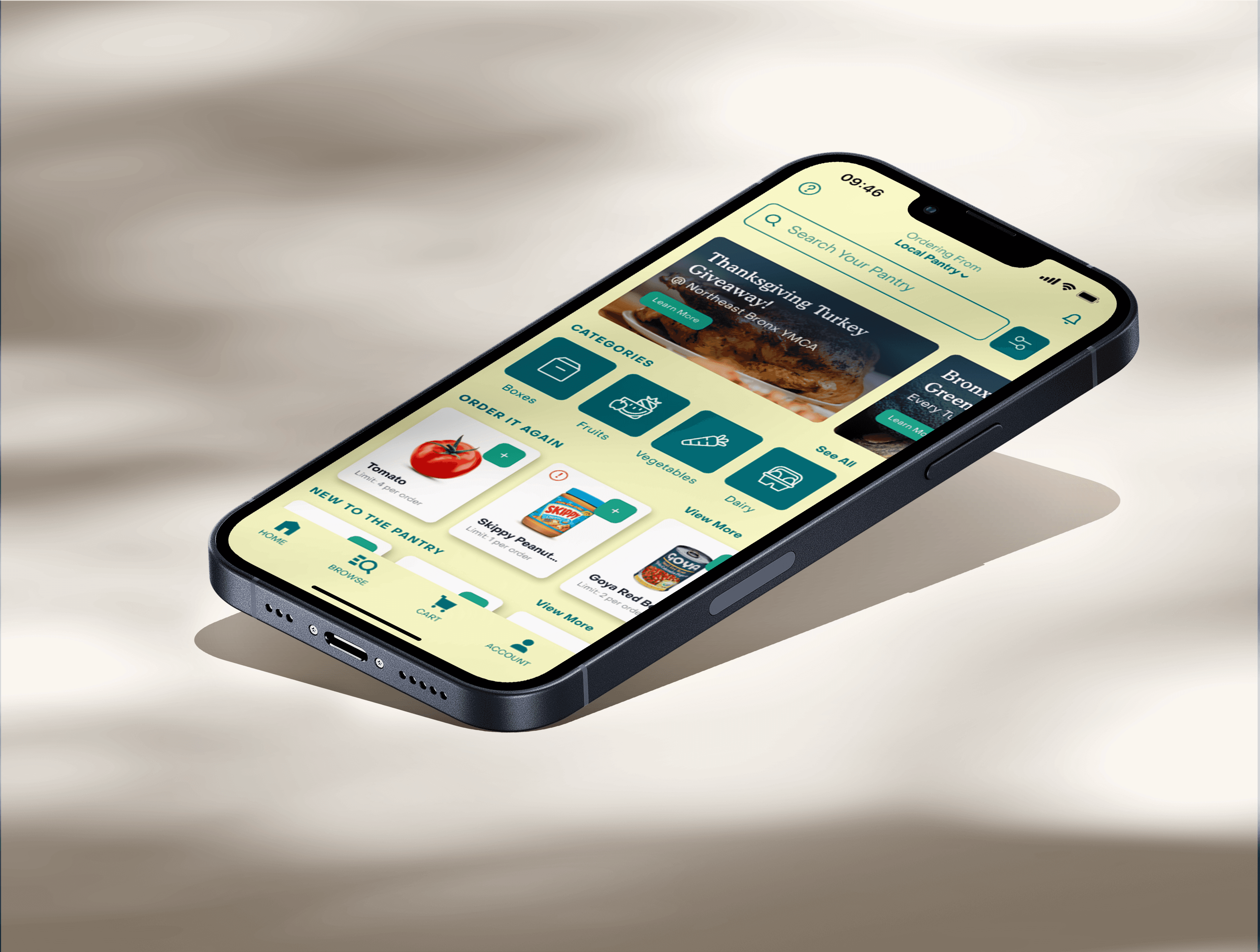
The Parcel Pantry’s visual language was born from the nostalgia and personableness of brown paper parcels. This warm, vintage aesthetic combined with the modernity of a program whose primary function is based in technology made for an interesting juxtaposition ripe for exploration.


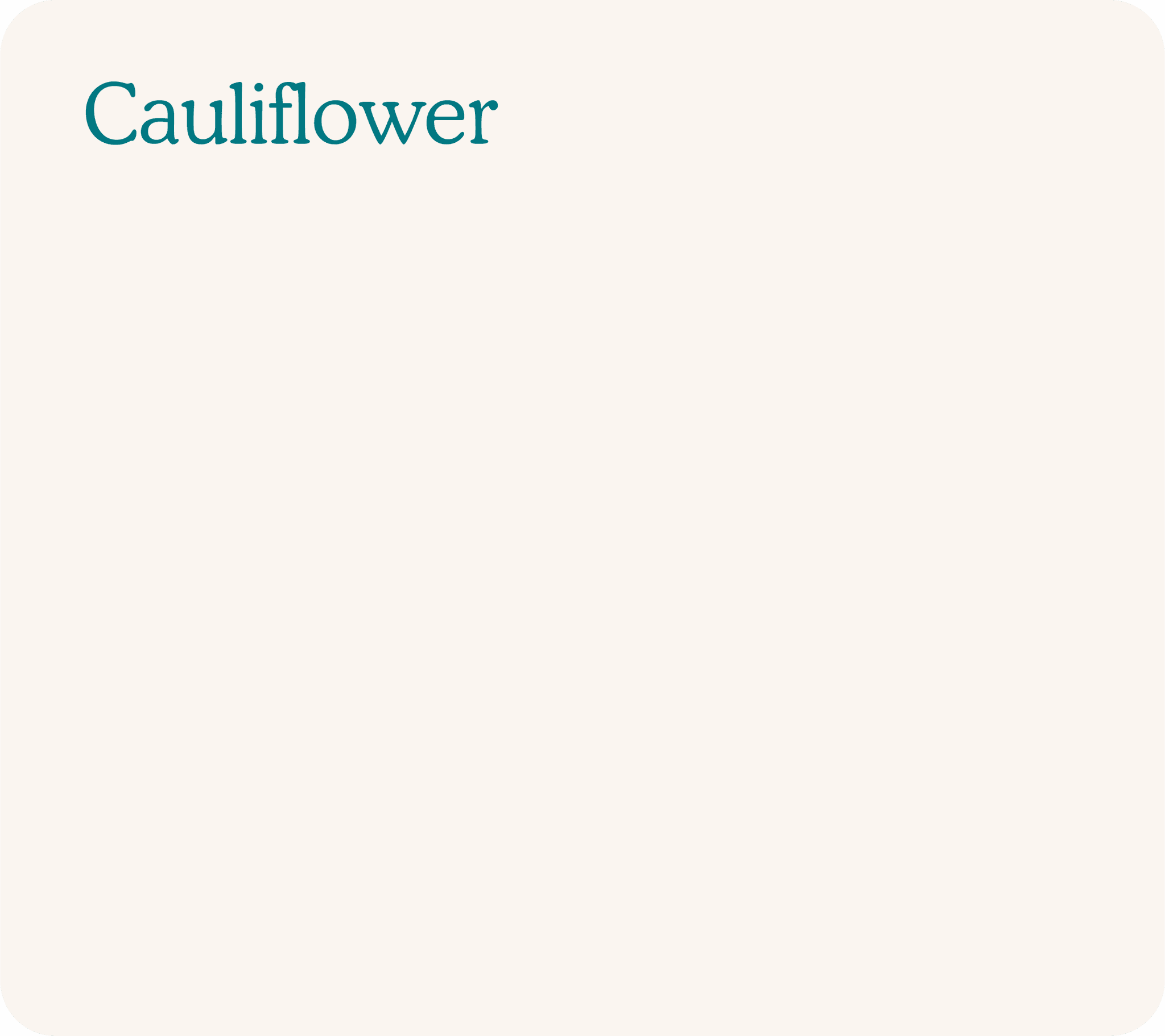
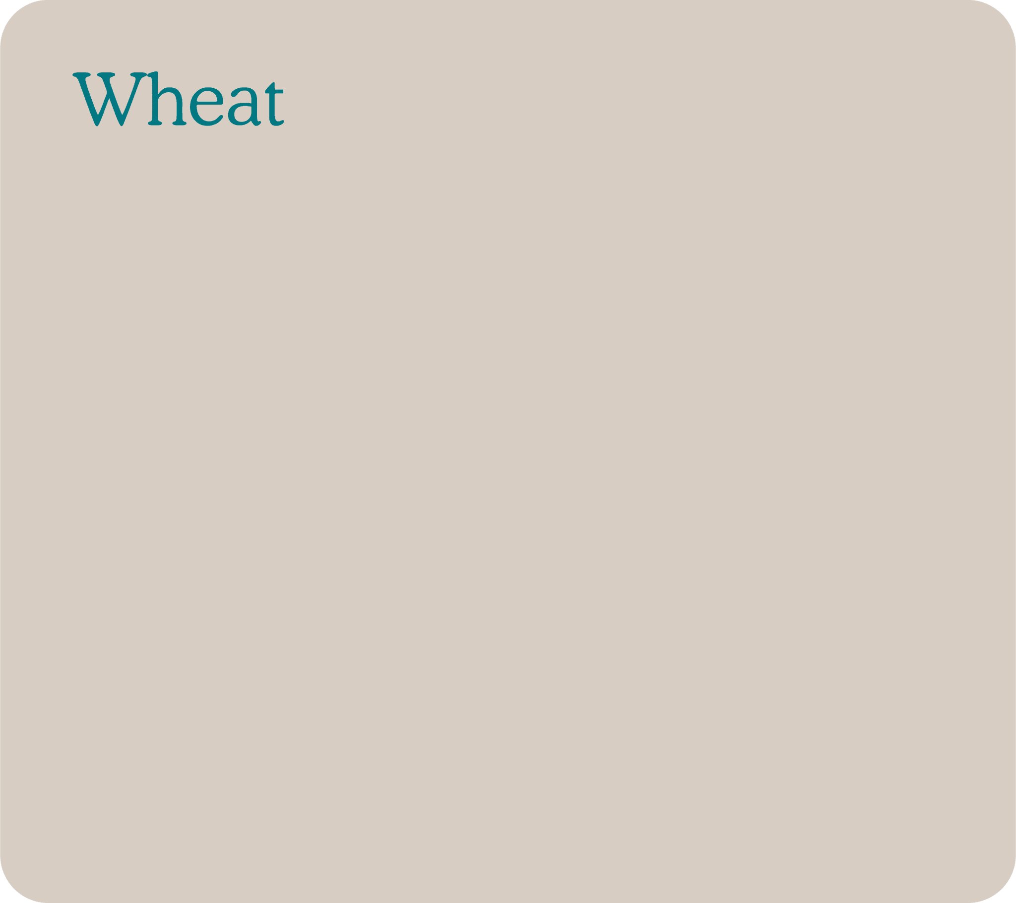
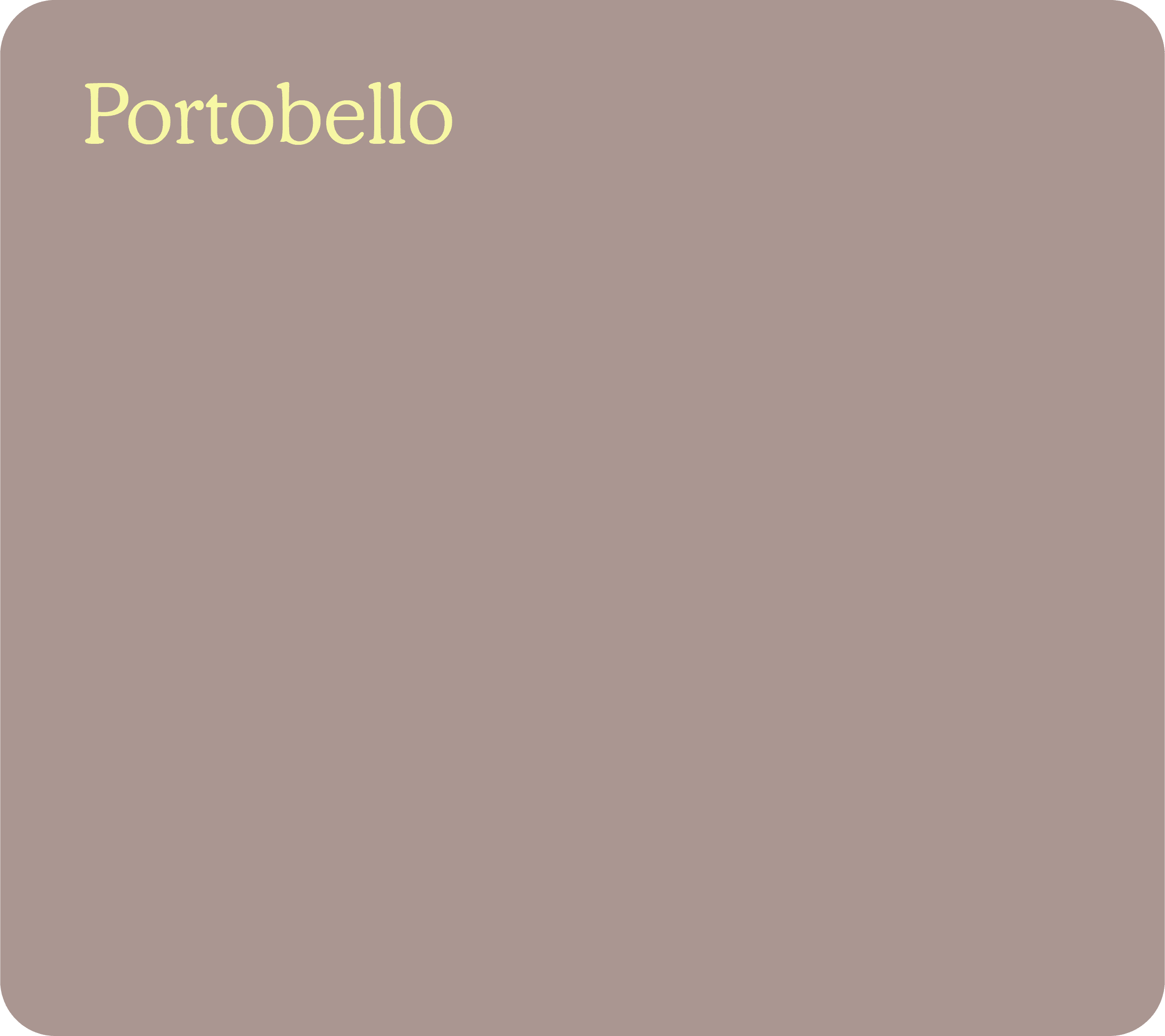
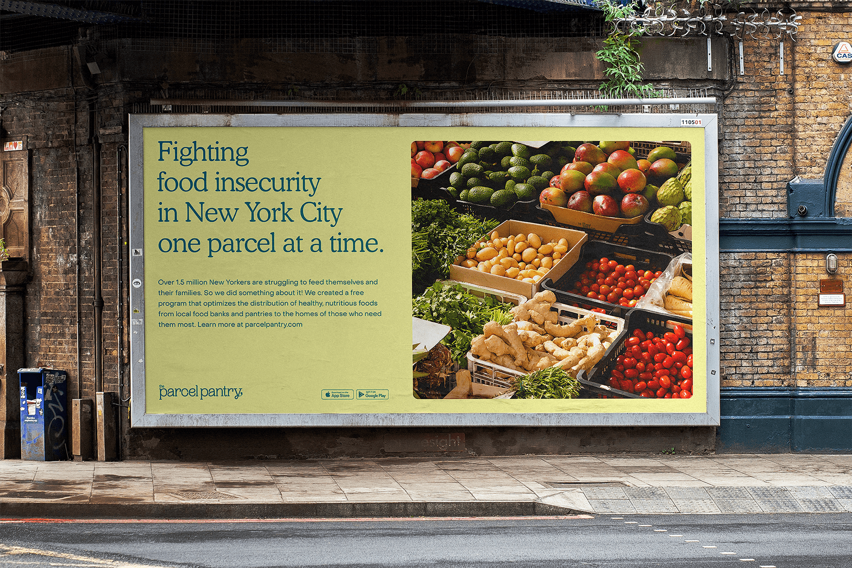
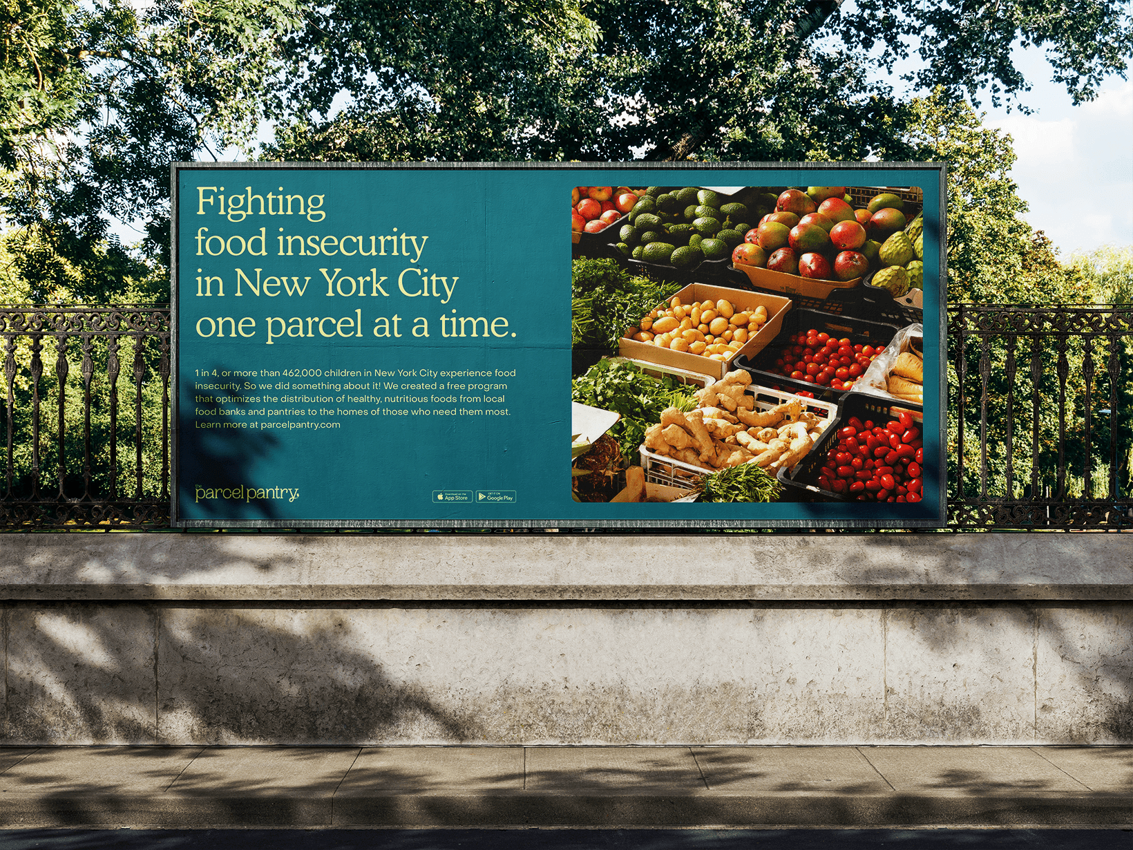
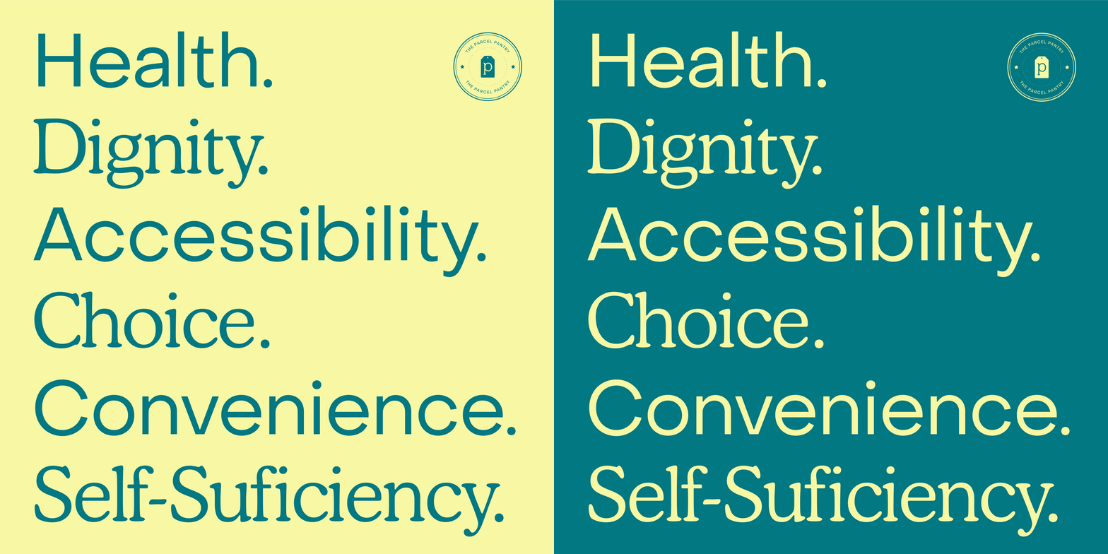
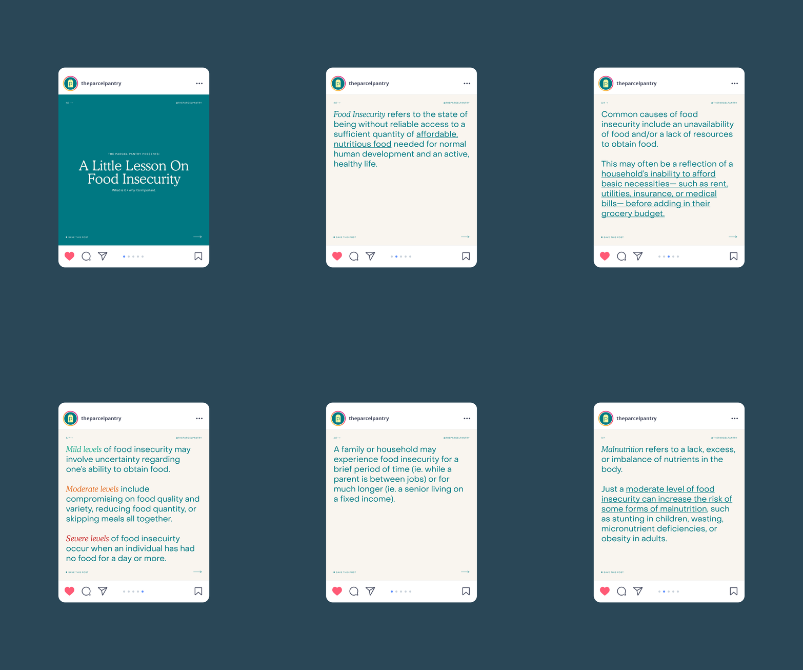
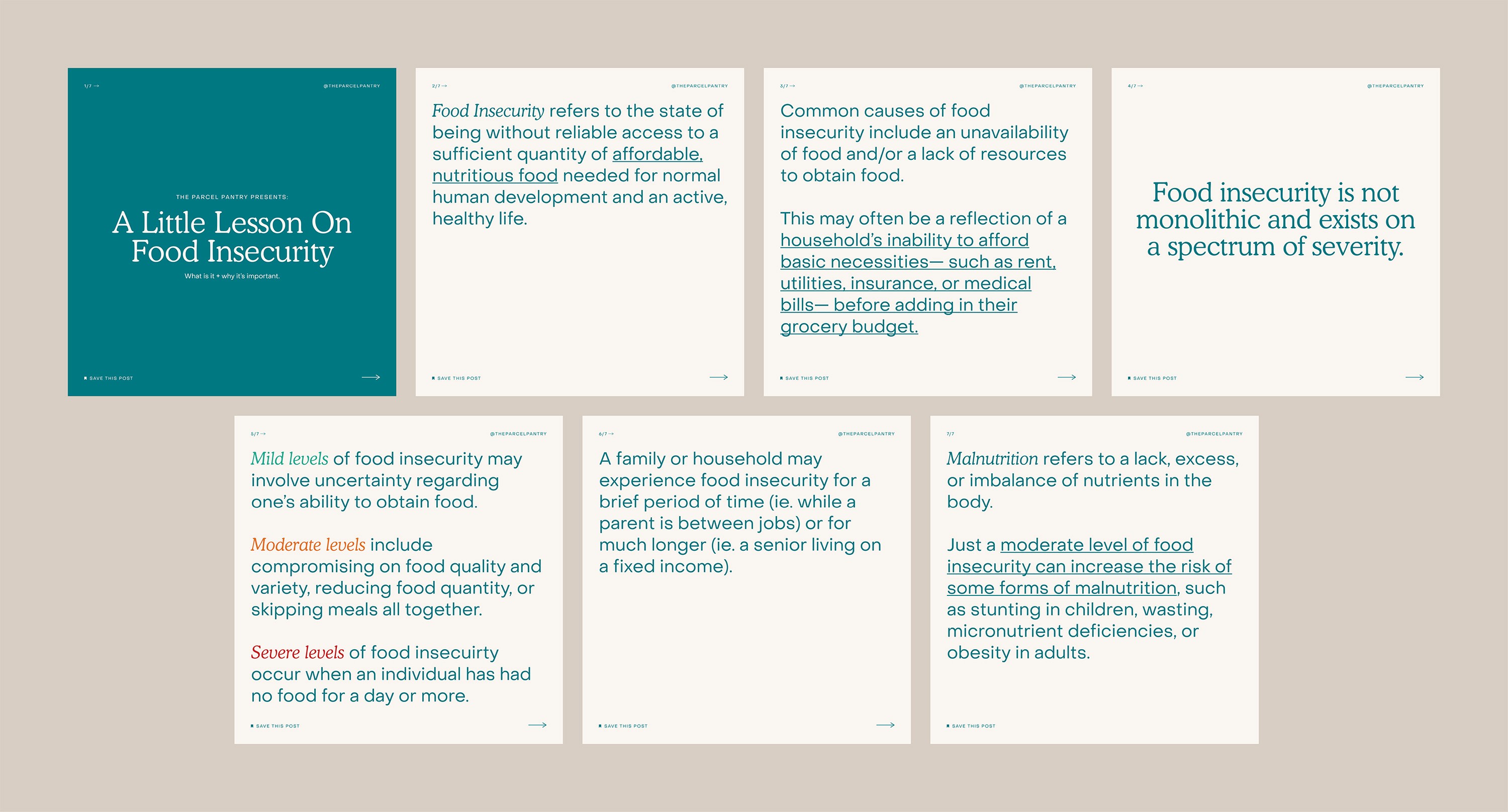
Color: The Parcel Pantry’s core color palette consists of yellow, greens, and blues that communicate hope, health, and technology. The neutral shades of cream and brown are a reference to the cream colored twine and brown paper used in old fashioned methods of wrapping parcels. They compliment the core color palette and are easier on the eyes when communicating large amounts of information.


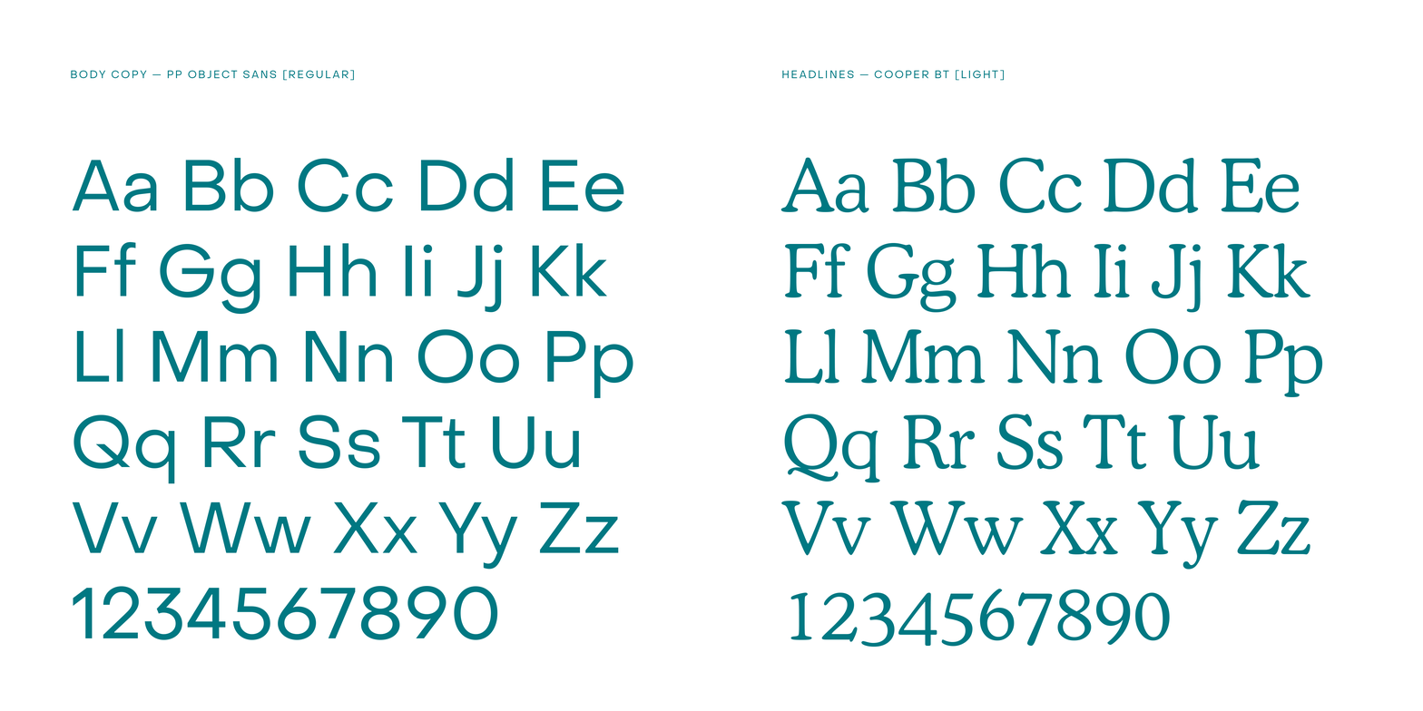
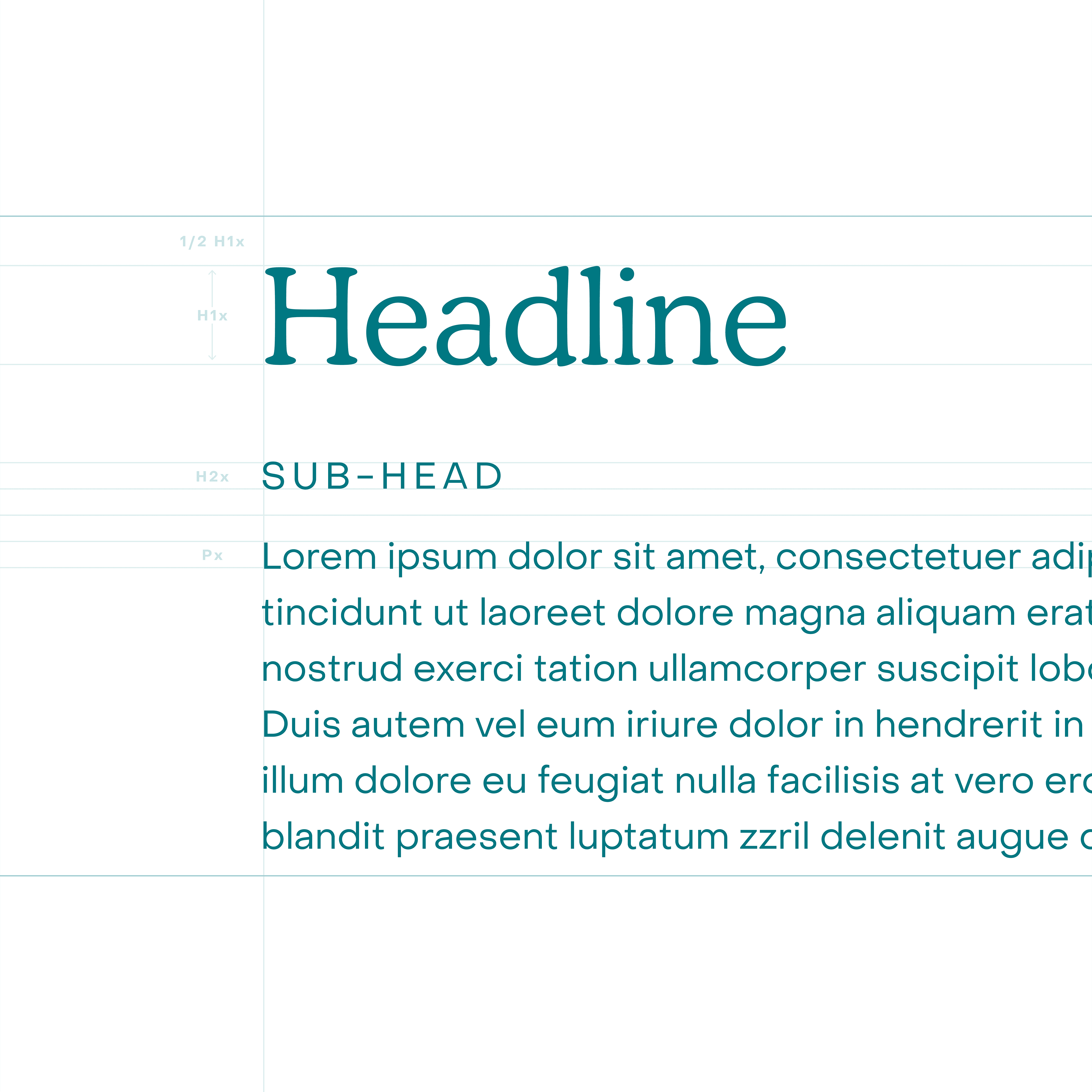
Typography: Cooper BT is The Parcel Pantry’s lead display typeface. It is rounded and soft in its design, which makes for a serif typeface that feels sincere while maintaining a sense of maturity. PP Object Sans is The Parcel Pantry’s workhorse typeface. It is a very geometric sans-serif typeface with its Regular weight being carefully tuned for small sized body text.


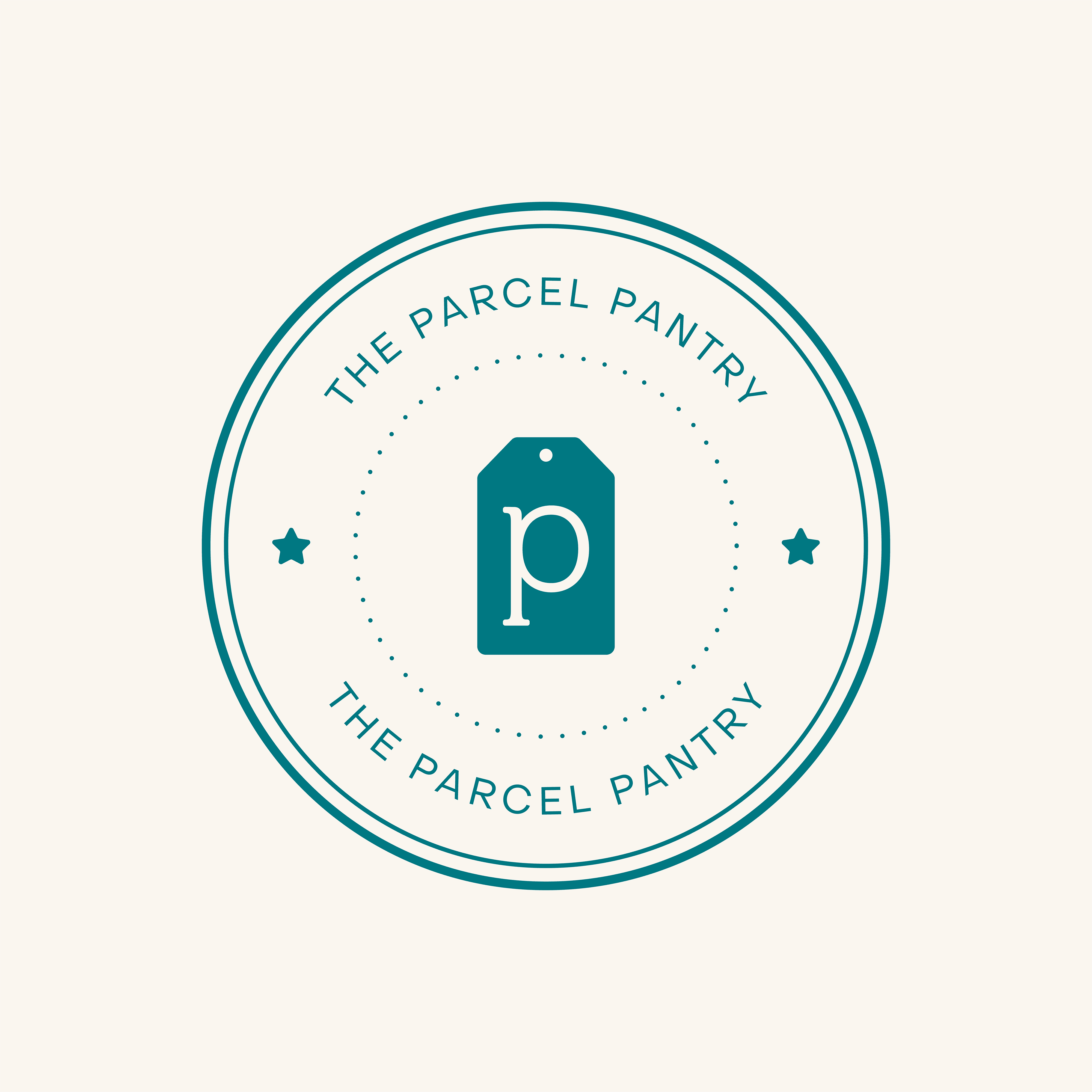
Brand Mark: The Parcel Pantry’s brand mark is heavily inspired vintage postage stickers and stamps. It allows for a more playful way of incorporating branding into designs, sometimes functioning as a watermark.


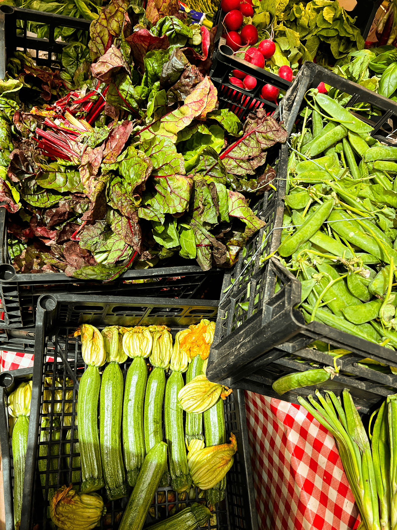
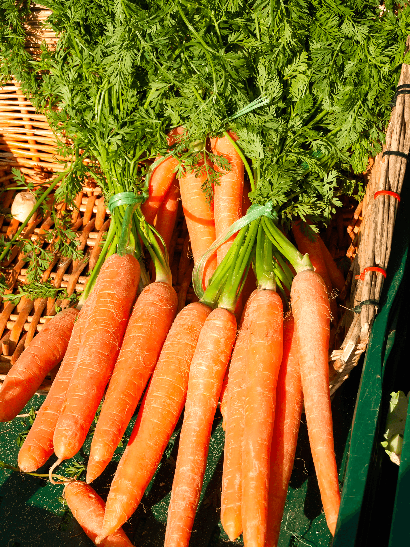
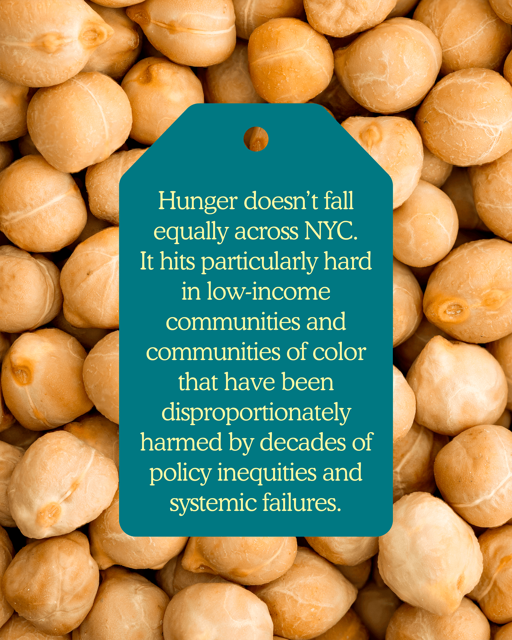
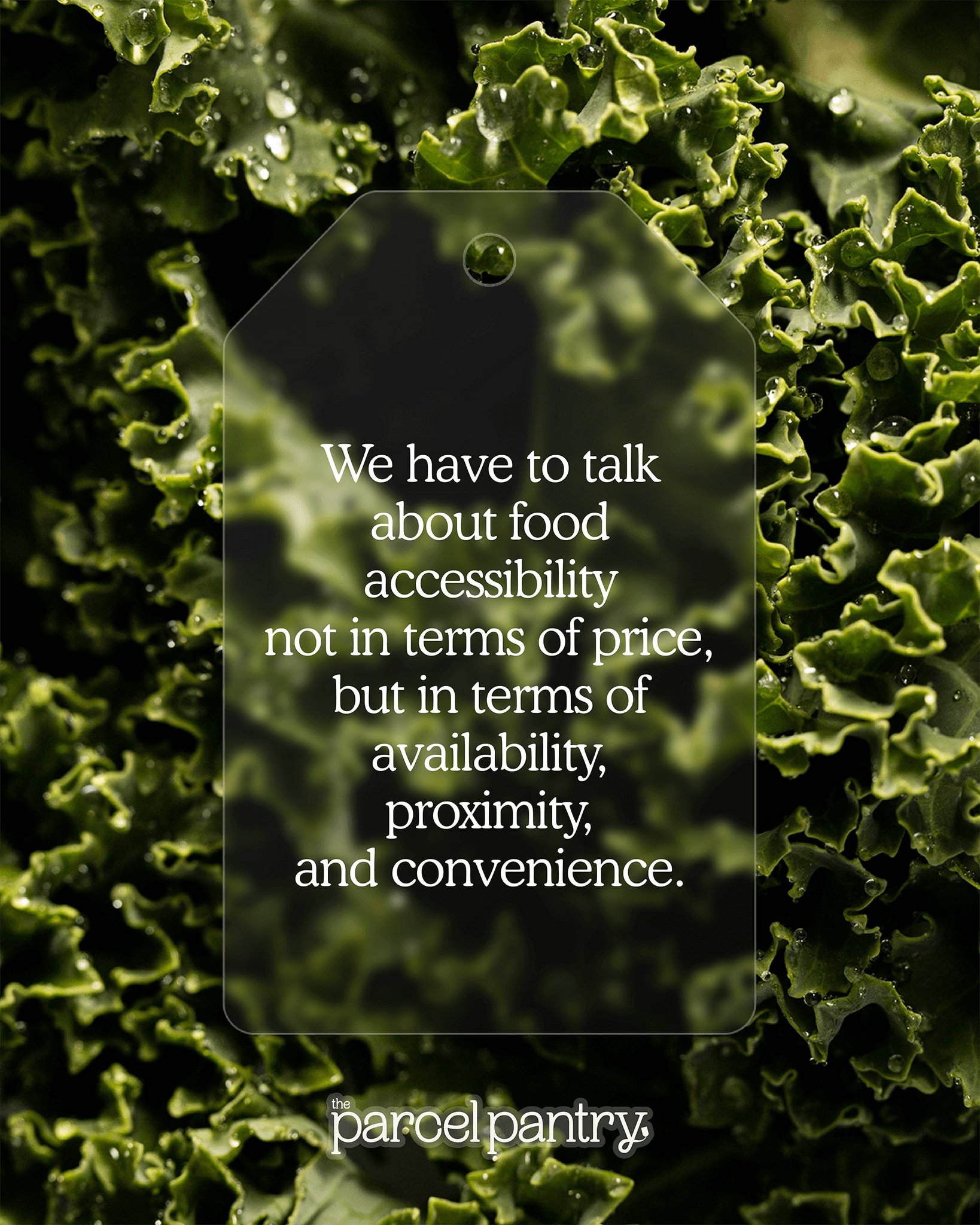
Photography: For photography, the main star of the show is food! The stacked and overhead photographs of various produce items is meant to reflect how produce is displayed at local greenmarkets. I also wanted all of the photography to be quite warm in temperature in order to feel inviting and complement the core color palette of greens and blues.

The Parcel Pantry’s visual language was born from the nostalgia and personableness of brown paper parcels. This warm, vintage aesthetic combined with the modernity of a program whose primary function is based in technology made for an interesting juxtaposition ripe for exploration.


Color: The Parcel Pantry’s core color palette consists of yellow, greens, and blues that communicate hope, health, and technology. The neutral shades of cream and brown are a reference to the cream colored twine and brown paper used in old fashioned methods of wrapping parcels. They compliment the core color palette and are easier on the eyes when communicating large amounts of information.


Typography: Cooper BT is The Parcel Pantry’s lead display typeface. It is rounded and soft in its design, which makes for a serif typeface that feels sincere while maintaining a sense of maturity. PP Object Sans is The Parcel Pantry’s workhorse typeface. It is a very geometric sans-serif typeface with its Regular weight being carefully tuned for small sized body text.


Brand Mark: The Parcel Pantry’s brand mark is heavily inspired vintage postage stickers and stamps. It allows for a more playful way of incorporating branding into designs, sometimes functioning as a watermark.


Photography: For photography, the main star of the show is food! The stacked and overhead photographs of various produce items is meant to reflect how produce is displayed at local greenmarkets. I also wanted all of the photography to be quite warm in temperature in order to feel inviting and complement the core color palette of greens and blues.

Contact

contact.bryannaandrew@gmail.com

© 2026 Bryanna Andrew

Contact

contact.bryannaandrew@gmail.com

© 2026 Bryanna Andrew

Contact

contact.bryannaandrew@gmail.com

© 2026 Bryanna Andrew